
After 60, the complexion changes. Skin pigments evolve, hair takes on silver or white highlights, and certain colors that once flattered can suddenly give a tired appearance. Elevating your wardrobe after 60 is less about renewing pieces and more about a precise work on the colors worn near the face.
Colors and Age Perception by Others: What Others Notice First
Have you ever noticed that a person looks more rested or dynamic depending on the color of their top? It’s not just a subjective impression. The color worn near the face alters the immediate perception of age.
Related reading : How to Boost Your Business Growth with Innovative B2B Solutions
A tone too close to the skin tone (light beige on fair skin, for example) tends to erase the contrasts of the face. The observer’s gaze finds no point of reference, and the overall impression becomes dull.
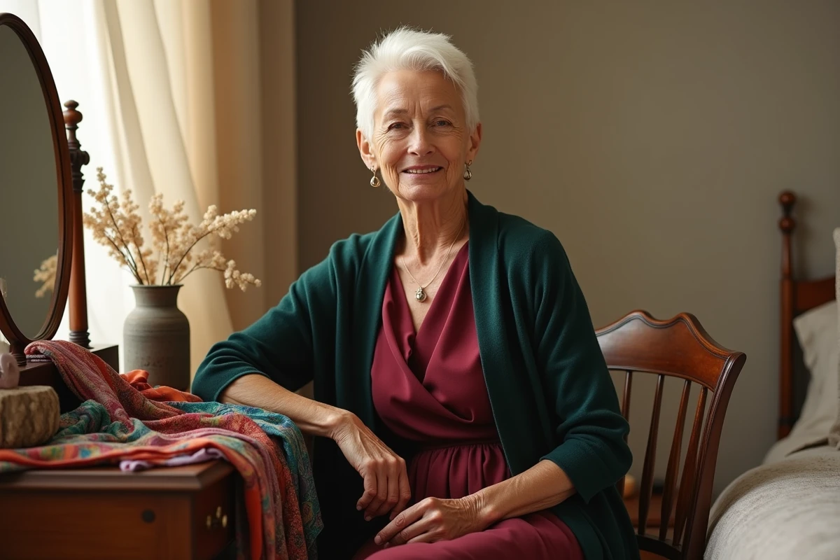
Conversely, a color that creates a slight contrast with the complexion enhances the definition of features. For senior peers, this measured contrast conveys an image of vitality without apparent effort. This mechanism explains why some 65-year-old women look younger in teal than in mouse gray.
Related reading : How to Improve Your Network for Better Remote Work at Home
To delve deeper into this topic, you will find tips for choosing clothing colors after 60 that detail suitable combinations for each skin tone.
The stakes go beyond personal harmony. In a group of active seniors, clothing color choices contribute to social dynamics: wearing vibrant shades signals energy that those around perceive and respond to positively.
Earthy Tones and Soft Pastels: Two Color Families to Master After 60
Not all colors are equal when the skin loses its natural glow. Two families of shades stand out for their ability to compensate for this evolution.
Earthy Tones for a Naturally Youthful Effect
Ocher, saffron, and clay are experiencing a marked resurgence among women over 60. According to the “Senior Fashion Color Trends” report by WGSN published in March 2026, earthy tones harmonize with age-related changes in complexion while bringing warmth to the face.
Specifically, a saffron-colored sweater worn over navy pants creates a soft contrast that warms the complexion without being harsh. Clay, being more muted, acts as a warm neutral and favorably replaces classic beige, which is often too dull.
Soft Pastels for Visual Comfort Outdoors
The “Senior Fashion and Well-Being” survey by IFOP for L’Oréal Paris, released in April 2026, confirms a growing preference for soft pastels (lavender, mint) over saturated bright shades among active seniors outdoors. Pastels offer increased visual comfort without straining the eyes, a factor that bright colors do not take into account.
A lavender jacket worn over an off-white blouse, for example, softens the features without erasing them. Powder pink, sky blue, and light coral operate on the same principle.
- Ocher, saffron, clay: warm the complexion and replace dull beiges as a neutral base for the wardrobe
- Lavender, mint, powder pink: bring freshness to the face while remaining visually comfortable, even in bright light
- Bordeaux, emerald green, plum: create a sharp contrast with gray or white hair, ideal for tops worn near the face
Pairing Colors with Your Silhouette: Three Concrete Principles for a Modern Look
Choosing the right color is not enough. Its placement on the silhouette changes everything.
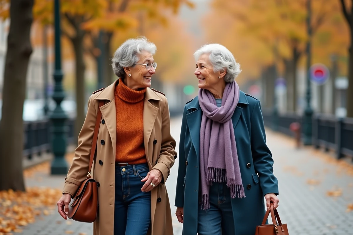
The brightest color should always be worn near the face. This is where it produces its maximum contrast effect. An emerald scarf over a gray coat draws the eye to the upper body and visually elongates the silhouette.
For the lower body, dark or neutral tones work better. Navy, charcoal, or chocolate pants unify the line of the legs. The combination of a colorful top and a neutral bottom is the most reliable formula to enhance your silhouette after 60 without taking style risks.
The third principle concerns accessories. One colorful accessory is enough to energize a sober outfit. A coral scarf, a mustard bag, or turquoise earrings provide the necessary pop of color without overwhelming the ensemble. The accumulation of bright colors produces the opposite effect: it blurs the reading of the silhouette.
- Colorful top (saffron, lavender, emerald) paired with a neutral bottom (navy, charcoal, chocolate) to structure the silhouette
- One colorful accessory to punctuate a sober outfit without overloading it
- Avoid the total light monochrome look (beige on beige, gray on gray) that erases the natural contrasts of the face
Saturated Bright Colors After 60: A False Good Idea or a Real Asset
Bright red, lemon yellow, or fuchsia catch the eye. But wearing a saturated bright color near the face after 60 requires special attention.
The problem is not the color itself. It’s the saturation mismatch between the garment’s hue and that of the skin. When the fabric is very saturated and the skin has lost its glow, the garment captures all the attention and the face takes a back seat. The effect can age more than it rejuvenates.
The solution lies in desaturation. A brick red instead of a bright red. A mustard yellow instead of a lemon yellow. An old rose instead of a fuchsia. These slightly muted versions retain the energy of the original color while remaining compatible with mature skin tones.
For women who are attached to bright red or electric blue, wearing it as an accessory (scarf, bag, shoes) rather than as a centerpiece allows for maintaining impact without imbalance.
Style after 60 is not built by avoiding color but by balancing its intensity. Each complexion reacts differently to shades, and the best test remains to hold the garment against the face in natural light, in front of a mirror. If the complexion appears brighter, the color is right. If the face seems duller, simply lower the saturation a notch to regain balance.